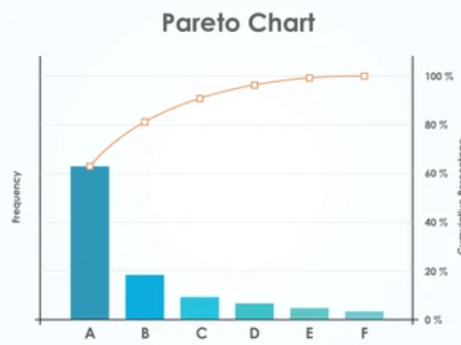
The Pareto chart, named after the Italian economist Vilfredo Pareto, is a powerful visual tool used for quality control and decision-making in various fields. This graphical representation combines both bar and line charts, providing a clear and insightful way to analyze data, identify key issues, and prioritize efforts for maximum impact. In this article, we will delve into the principles, construction, and applications of Pareto charts.
Understanding the Pareto Principle:
The Pareto Principle, also known as the 80/20 rule, asserts that approximately 80% of effects come from 20% of causes. Vilfredo Pareto originally observed this principle when he noted that 80% of the land in Italy was owned by 20% of the population. This principle has since been widely applied in various domains, including business, economics, and quality management.
Key Components of a Pareto Chart:
1. Data Collection:
The first step in creating a Pareto chart is to collect and categorize data. This could involve identifying defects, causes of issues, or any other factors relevant to the problem at hand.
2. Categories and Frequency:
Data is then grouped into categories, and the frequency of each category is determined. This frequency represents the number of occurrences of each category.
3. Bar Chart:
The categories are plotted on the x-axis, and the corresponding frequencies are represented by the height of the bars on the y-axis. Bars are arranged in descending order, from the category with the highest frequency to the lowest.
4. Cumulative Percentage Line:
A cumulative percentage line is overlaid on the bar chart. This line helps visualize the cumulative contribution of each category to the total. It is often represented by a line graph on the secondary y-axis.
Steps to Create a Pareto Chart:
Step 1: Identify the Problem and Data
Clearly define the problem you want to address and gather relevant data.
Step 2: Categorize the Data
Group the data into categories that are meaningful for your analysis.
Step 3: Calculate Frequencies
Determine the frequency of occurrences for each category.
Step 4: Create the Bar Chart
Plot the categories on the x-axis and their frequencies on the primary y-axis to create the bar chart.
Step 5: Add Cumulative Percentage Line
Overlay the cumulative percentage line on the secondary y-axis.
Step 6: Analyze and Prioritize
Interpret the chart to identify the categories contributing most significantly. Focus on addressing the high-impact issues first.
Applications of Pareto Charts:
1. Quality Control:
In manufacturing and production, Pareto charts help identify the most frequent defects or issues affecting product quality.
2. Business Decision-Making:
In business, Pareto charts assist in prioritizing tasks or areas that contribute most significantly to overall success.
3. Problem-solving:
In problem-solving processes, Pareto charts highlight the critical factors that need attention for efficient resolution.
4. Project Management:
Pareto charts are useful in project management to identify and tackle the most influential challenges.
5. Time Management:
Identifying the most time-consuming activities in a process can aid in optimizing workflows and increasing efficiency.
Conclusion:
The Pareto chart stands as a valuable tool for decision-makers seeking to optimize resources and address the most critical issues affecting a system. By visualizing data according to the Pareto Principle, organizations can strategically allocate efforts, resources, and time, resulting in more effective problem-solving and improved overall performance. Embracing the Pareto chart is not just about analyzing data; it’s about making informed decisions that lead to impactful and positive outcomes.

